

Overview
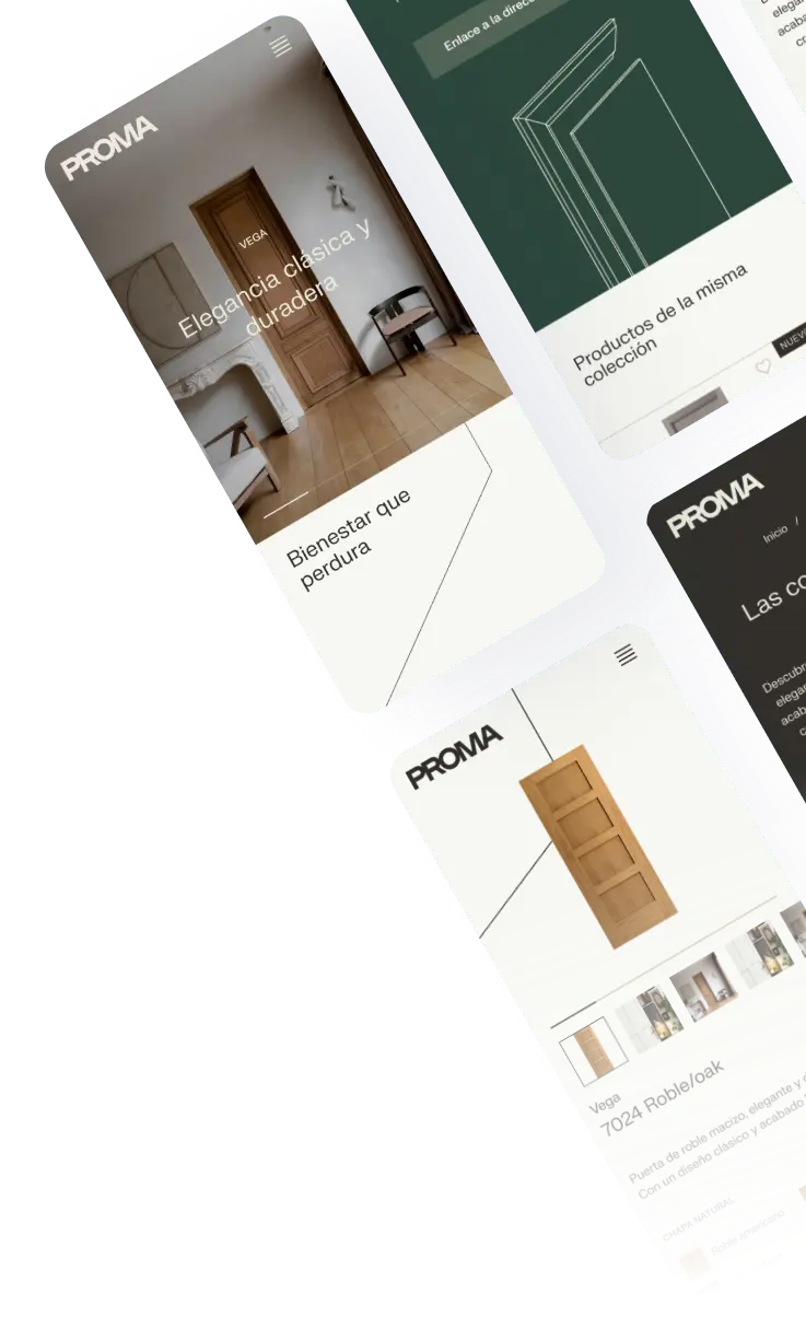
Proma is a Spanish company specialising in high-quality doors, combining traditional craftsmanship with a focus on materials, design and product performance.
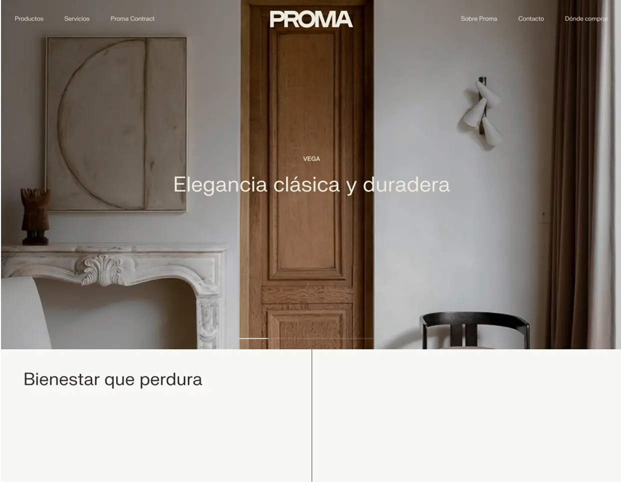
The goal of this project was to redesign its website and create a digital experience that better reflected the quality of its products. The existing website felt outdated, while the product catalogue was presented mainly through downloadable PDFs, making it difficult for users to explore and discover the different products.
The challenge was to rethink the website structure, improve product discovery and communicate what makes Proma different — while creating an experience that could serve both industry professionals and private customers.
The challenge
Proma's products are positioned in a higher-quality segment than those typically found in large retail chains. However, the existing digital experience did not communicate that added value effectively.
There were two main challenges:
- Brand perception: Modernise the website so that its visual and content experience reflected the quality, craftsmanship and expertise behind the products.
- Product discovery: Replace the limitations of a PDF-based catalogue with a more intuitive way to browse collections, models, materials and finishes.
The website also needed to address different audiences, from construction and renovation professionals to people choosing doors for their homes.
My role & approach
I led the UX research and strategy phases of the project, taking ownership of:
 Interviews with Proma's commercial team.
- Research synthesis and insight definition.
- Competitive benchmarking.
- User persona definition.
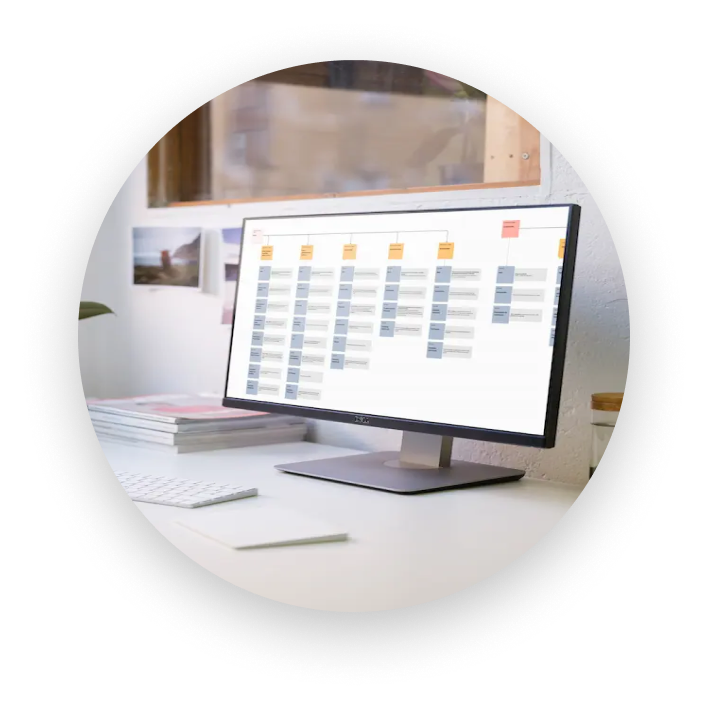
- Information architecture and sitemap.
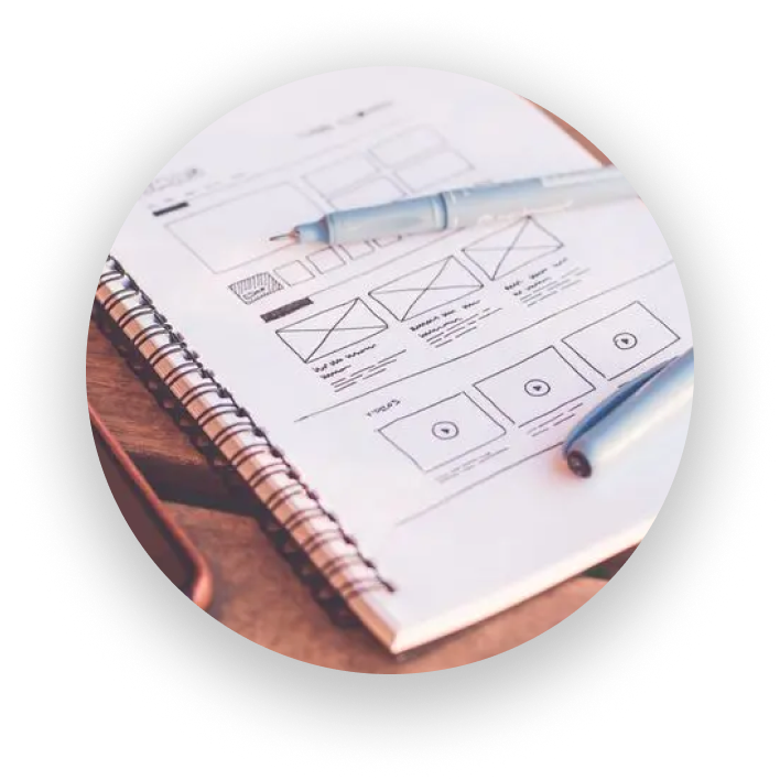
- Wireframes for the entire website.
I presented the sitemap and wireframes to the client and gathered their feedback and approval before moving into the UI phase.
During the UI phase, I collaborated on the design of selected screens and responsive adaptations. The overall art direction was led by another designer.
Understanding users and the business
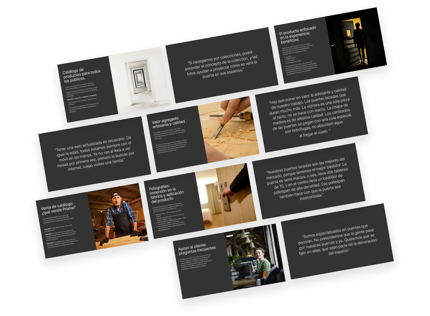
Rather than starting with assumptions, I interviewed members of Proma's commercial team — people who work directly with customers and have first-hand knowledge of their questions, needs and decision-making process.
One of the key insights was that the website needed to work for both professionals and end customers, without making the experience unnecessarily complex for either group.
The interviews also highlighted the importance of communicating product quality through concrete information, not just marketing messages.
For example, customers should be able to understand the materials, manufacturing process and technical benefits behind each door. Details such as the durability of lacquered doors, high-quality wood veneers or the water resistance of specific construction elements could help demonstrate the difference in quality.
Another important finding concerned the product catalogue itself. Its structure needed to follow a clear and consistent hierarchy:
Material → Collection → Models → Finishes
This would make it easier for users to understand the product range and navigate between its different levels.
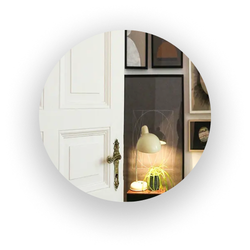
The team also emphasised the importance of visual content: workshop photography, manufacturing details and product images showing doors both isolated and in real-life interiors.
Competitive benchmarking
To understand how other brands approached similar challenges, I analysed six national and international companies in the door industry.
The benchmark focused on four main areas:
-

Homepage and navigation
including content hierarchy, key sections and pathways to explore the brand and product catalogue
-

Product Listing Pages (PLP)
Including filters and search
-

Product Detail Pages (PDP)
Including where-to-buy information
-

Sustainability and brand values
including company heritage, craftsmanship, manufacturing processes and environmental commitment.
The analysis helped identify opportunities to improve the overall experience, including:
- Keeping the main navigation clear and concise.
- Connecting product information with the brand's value proposition.
- Supporting different user types with relevant content.
- Making product search more useful through predictive search and relevant results.
- Using meaningful filters based on product benefits and technical features.
- Providing alternative product suggestions when no results are found.
- Offering high-quality imagery and ways to explore different finishes.
- Keeping downloadable catalogues and technical documents available, particularly for professional users.
These findings helped shape the direction of the new information architecture and product discovery experience.
Defining the users
Based on the research and the different audiences Proma serves, I defined three user personas:
-
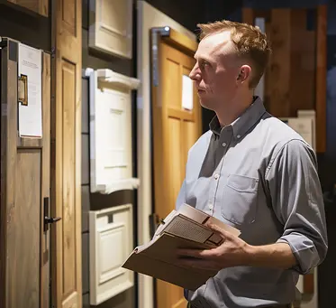
The renovation or construction professional
Someone who needs clear product specifications and technical information to evaluate and recommend suitable doors for a project.
-

The building materials distributor
A professional who needs to understand the product range and access relevant information to advise customers.
-

The private customer
Someone renovating their home who needs to explore different designs, collections and finishes, understand product characteristics and find where to buy.
These personas helped ensure the new website would not focus exclusively on one type of customer.
Information architecture
One of the most important parts of the project was restructuring the website.
I created the sitemap to organise Proma's content into clear sections, balancing product discovery with the information needed to communicate the company's expertise and values.
The structure included:
Collections
A way to explore Proma's product ranges through their design and identity.
Product catalogue
A structured area to browse products and access individual product pages.
Proma Contract
A dedicated area for the company's contract offering.
About Proma
Information about the brand, its history, values and way of working.
Our workshop
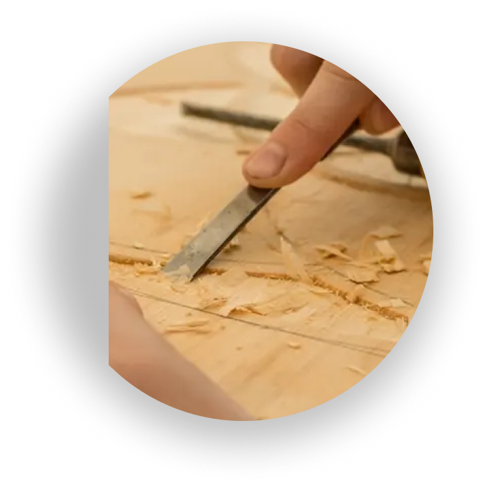
Content about manufacturing, craftsmanship, materials and processes.
Sustainability
Information about the company's environmental commitment.
Where to buy
A way to locate distributors.
Contact
Direct access to the company.
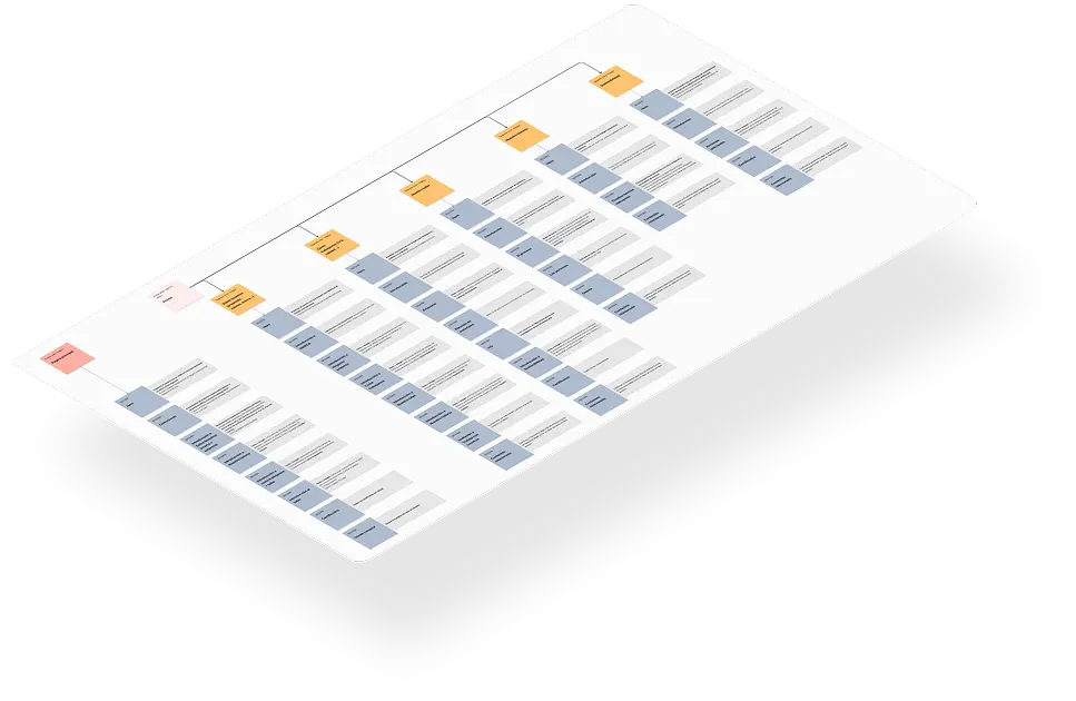
The product catalogue followed the hierarchy identified during research: material, collection, model and finish.
This created a more consistent structure for exploring the range and understanding how the different products relate to one another.
Designing the product discovery experience
The PLP and PDP were particularly important deliverables because they addressed one of the project's biggest challenges: making Proma's catalogue easier to explore.
Product Listing Page (PLP)
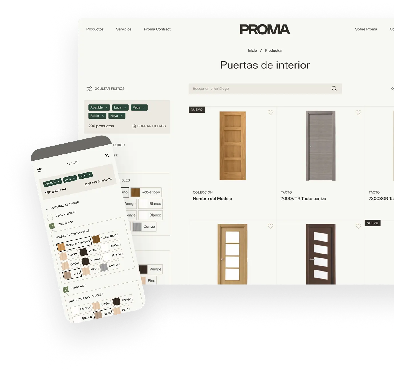
The new catalogue was designed to offer several ways to refine and explore the product range.
It included:
- A dedicated product search.
- Filters based on benefits, performance, dimensions, materials, collections, models and finishes.
- Sorting options by model name, collection name and recommended products.
- Product cards showing the collection, model name and a short description highlighting relevant materials and benefits.
- Recommendations to help users discover other products.
The filters were designed around information that matters when choosing a door, such as noise reduction, fire protection, light insulation and material.
Product Detail Page (PDP)
The product page was designed to bring the most relevant information together in one place, helping users understand the product before deciding where to buy it.
Its structure included:
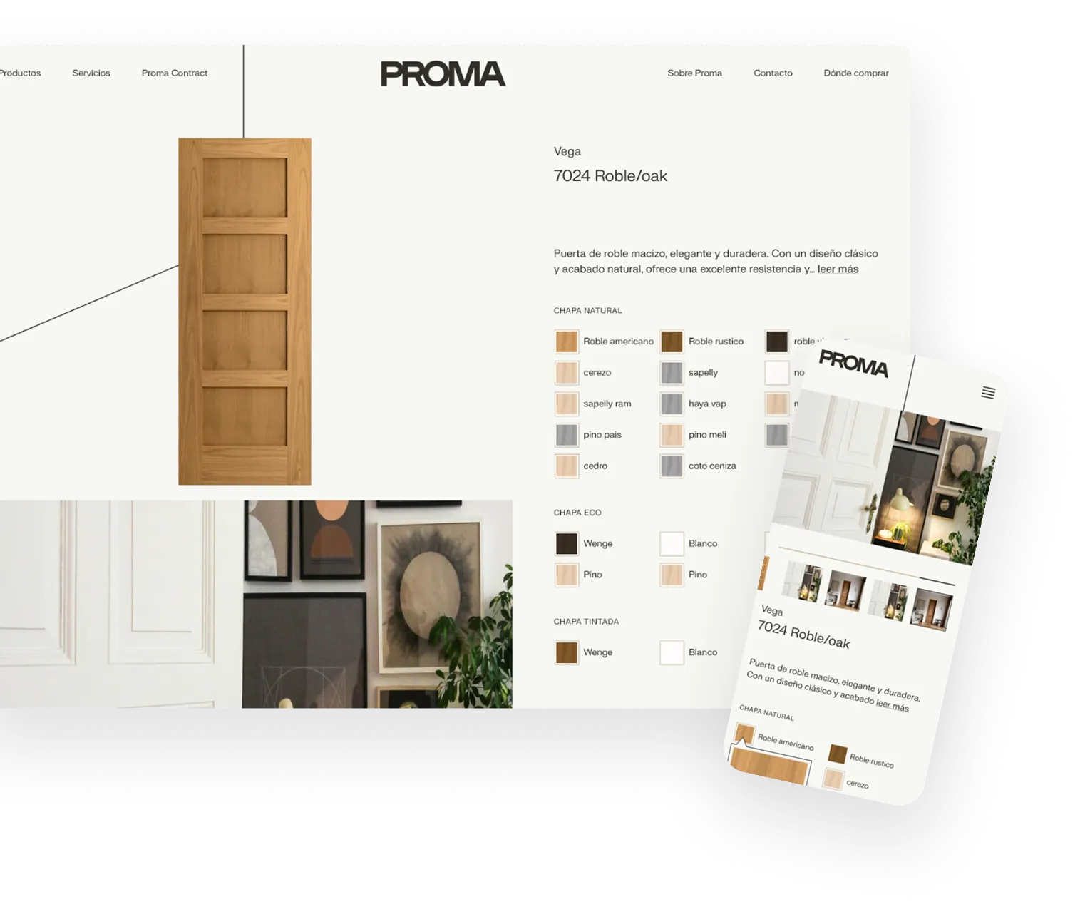
- A product image gallery combining isolated product shots, contextual imagery and close-up details.
- Product descriptions covering design, materials and functional benefits.
- Technical specifications and dimensions.
- Access to distributors through the where-to-buy section.
- Downloadable resources, including technical sheets and image galleries.
- Recommendations for products from the same collection.
- Similar products from other collections.
The recommendations were designed to encourage further exploration of Proma's catalogue and help users discover relevant alternatives.
From wireframes to final design
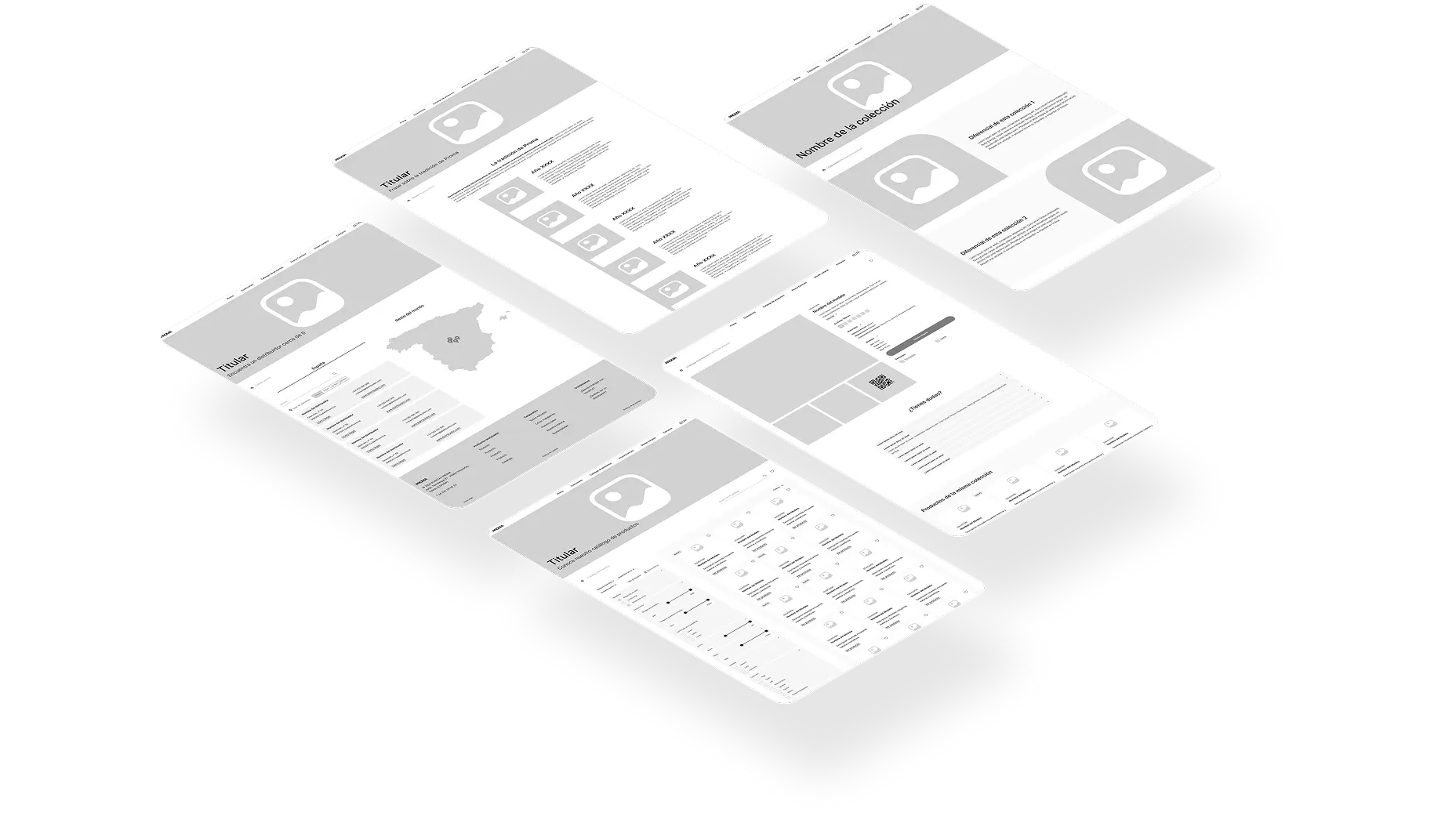
Once the information architecture and wireframes were ready, I presented them to the client for review and validation.
This ensured that the structure and proposed experience were aligned with the business before moving into the visual design phase.
I then collaborated on selected UI screens and responsive adaptations, working from the UX foundations established earlier in the project.
Some initial ideas were also refined as the project evolved:
-

Favourites
This feature was removed because the decision was made not to include user accounts or a login system. Without a way to identify users, saving personal favourites would not have been supported.
-

Augmented reality
Due to budgets and timing, this was not included in the final scope.
-

FAQ sections
It was decided to replace it with a contact form, providing users with a direct way to get in touch with Proma.
-

Product recommendations
This was retained, both for products within the same collection and similar products from other collections.
These decisions helped align the final experience with the agreed scope and functionality.
Outcome
The redesigned Proma website was successfully launched, introducing a more structured digital experience for the brand and its product offering.
The new information architecture created a clearer separation between corporate content, collections and product information. The redesigned catalogue experience was also brought to life, making it easier for users to explore the product range through a structured hierarchy, relevant filters, technical information and product recommendations.
The new PLP and PDP helped transform the catalogue from a primarily PDF-based resource into a more accessible digital product discovery experience.
No quantitative post-launch data was available to measure the impact of the redesign, so the outcome is best understood through the delivered work and the new experience established for the website.
Reflection
This project was an opportunity to turn a complex product range and a wealth of company knowledge into a clearer digital structure.
By combining insights from the commercial team, competitive analysis and information architecture, I helped establish the foundations for a website that could communicate Proma's product quality while making its catalogue easier to understand and explore.