

Overview
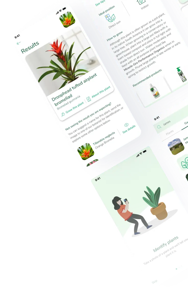
Plantsnapp is a mobile app that allows users to identify plants by taking or uploading a photo. Beyond identification, the app provides botanical information, practical care advice and a community where plant enthusiasts can share their discoveries.
The project involved a complete redesign of the existing mobile experience, driven by two main needs: refreshing the app's visual identity and integrating a new commercial partnership into the product.
Working closely with product managers and stakeholders, I helped translate this business opportunity into a more contextual experience, making product recommendations feel like a natural extension of the plant discovery and care journey.
The challenge
The existing app displayed random advertisements across different screens, regardless of what users were doing. Ads could appear even during the plant identification process, interrupting one of the product's core experiences.
At the same time, a new commercial partnership created an opportunity to introduce relevant plant-related products through an external retailer.
The challenge was to rethink how commercial content could become part of the product experience without compromising usability or distracting users from their main goals.
The project had two complementary objectives:
- Improve the user experience: Refresh the interface, improve information hierarchy and make the app easier to navigate and understand.
- Support a new business opportunity: Integrate contextual product recommendations connected to the plant identification and care experience.
The key question was:
How might we make product recommendations relevant and useful, rather than feeling like disruptive advertising?
My role & approach
As the Product Designer, I was responsible for the UX/UI design and prototyping of the redesigned app.
I participated in strategic discussions with product managers and stakeholders, helping define how the new commercial partnership could be integrated into the existing experience.
The commercial strategy was a business decision developed collaboratively. My contribution was to translate that opportunity into interface solutions and define how commercial content could be presented within the user journey.
My work included:
 Participating in discussions to define the new experience and commercial placements.
- Redesigning the app's main screens and user-facing flows.
- Improving content hierarchy, readability and visual consistency.
- Designing contextual product recommendation components.
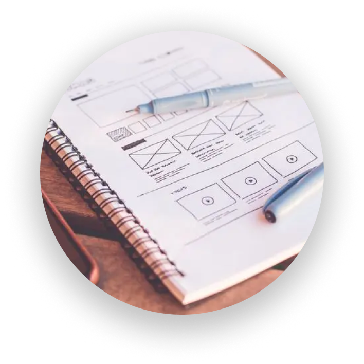
- Creating prototypes and delivering the final designs.
The strategy: contextual monetization
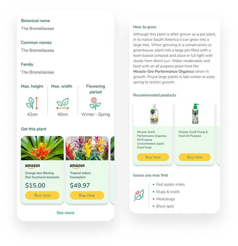
The new partnership introduced an automated product recommendation experience connected to plant identification.
Instead of showing unrelated advertisements throughout the app, the redesigned experience made room for relevant recommendations within the plant discovery and care journey.
Depending on the identified plant and the context, users could discover:
- Products to care for their plants, integrated into relevant care information.
- Plants available to purchase, displayed in a dedicated section within the plant profile.
Recommendations were displayed automatically by the system. The design challenge was therefore to create suitable spaces and formats for this content, ensuring it felt connected to the information users were already exploring.
One important consideration was that not every photo represented a plant owned by the user. Someone might identify a plant in a park, a garden or while travelling. The experience therefore needed to accommodate both learning about a plant and discovering the possibility of purchasing it.
Designing the core experience
The plant identification journey was central to the product, so it was important that the redesign made this experience clear and easy to use.
Plant identification
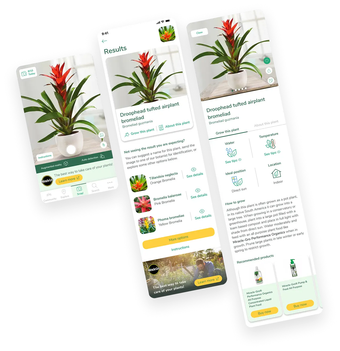
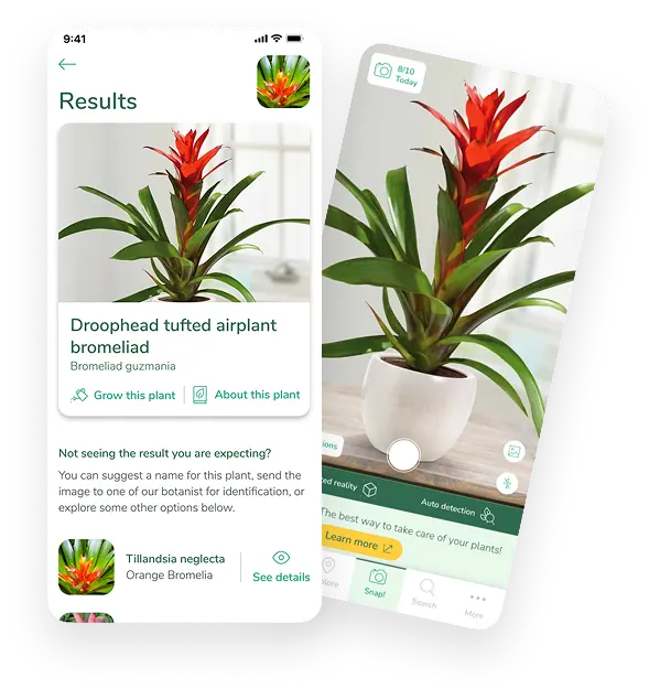
The camera is one of the app's primary entry points. I redesigned the interface to keep the plant photograph at the centre of attention, while maintaining access to the main actions.
After taking a photo, users can review the identification results, explore alternative suggestions and access more detailed information.
Plant information and care
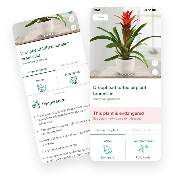
The plant profile brings together several types of information:
- Botanical description and characteristics.
- Watering and temperature requirements.
- Light, location and frost hardiness.
- Practical growing advice.
- Potential pests and diseases.
- Related products and purchasing options.
I worked on the information hierarchy and presentation of these sections to make detailed content easier to scan and understand.
The goal was to balance informative content with commercial recommendations, so that product cards complemented the experience rather than competing with the plant information.
A more consistent visual language
Alongside the commercial integration, the project involved refreshing the overall visual experience.
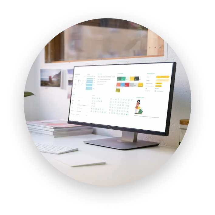
I aimed for a clean and simple interface that allowed plant photography and useful information to take centre stage.
Some of the main design principles were:
-

Clear information hierarchy
Improving the readability and organisation of content.
-

Photography-led layouts
Giving prominence to real plant photographs uploaded by users rather than relying on stock imagery.
-

Simple visual language
Using a clean interface, restrained layouts and colourful icons to make information easier to recognise.
-

Consistency
Applying a more cohesive visual approach across the different sections of the app
The result was a more unified experience while retaining the existing navigation structure.
Beyond plant identification
The redesign covered the entire app, not just the core identification journey.
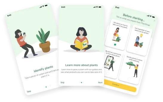
I also worked on the onboarding, login, search, explore, community, profile and settings experiences.
Onboarding
The onboarding flow introduces the app's main possibilities and asks users what they expect from Plantsnapp: identifying plants, learning how to care for them, discovering new plants or joining the community.
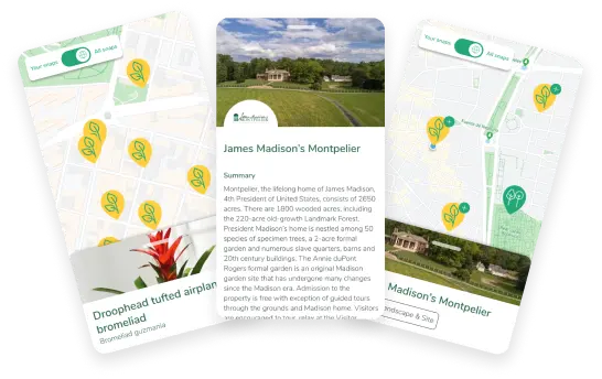
Explore
The Explore section displays users' plant discoveries on a map, allowing them to revisit their snaps and explore their locations.
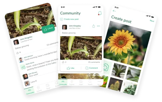
Community
The Community section allows users to share plant photographs, create posts, interact with other users and receive notifications.
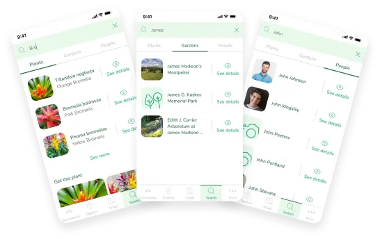
Search
The search experience brings together different types of content, allowing users to search for plants, gardens and people.
Outcome
The redesigned app was successfully implemented and launched. The project delivered:
- A complete visual redesign across the app.
- A refreshed and more consistent user experience.
- A contextual product recommendation experience connected to plant identification.
- New commercial placements supporting the partnership with an external retailer.
- Redesigned onboarding, identification, plant profiles, search, explore and community experiences.
Most importantly, the project translated a business opportunity into a product experience where commercial recommendations were connected to what users were already exploring.

Reflection
This project was an opportunity to work at the intersection of user experience and business needs.
It reinforced the importance of considering monetization as part of the overall product experience, rather than treating advertising as an isolated element.
It also highlighted how thoughtful content placement, clear information hierarchy and a consistent visual language can help create a more coherent experience across a product with multiple purposes.
The main takeaway: Commercial opportunities can be integrated into a product in a way that supports its purpose, provided that relevance and user context remain central to the design.